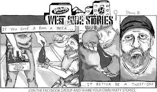
The building blocks are here. I finally shot some footage and will be messing around with it in After Effects.
I am posting my progress thus far. On the surface, it doesn't look like much, and I have a great deal of work to do between now and the deadline. However, all of the pieces are available.
I have 2 comics roughed up and am planning to animate about 5 more along with transitions for the comics. The trick at this point will be timing. The high energy of the song needs to sync up perfectly with the flow of the footage so I will be playing around with that as well. This video is just a glimpse at my progress and a rough visual representation of where I am going with it.


